
Main Street Theater
Main Street Theater is a local movie theater that offers visitors the opportunity to reserve a theater seat in advance. Typical visitors are between 18 and 40 years of age. Main Street Theater offers in-theater dining and premium seating to create the ultimate theater experience.
Project Duration: November 2022 to December 2022

The Problem
Movie Theater goers want to have a premium viewing experience without stress. With more people visiting theaters since COVID started, it is more important than ever to make viewers feel comfortable visiting our theater.
The Goal
Design a Main Street Theater website that makes it easier for visitors to select a movie, movie time, and seat. The website must be easy to navigate and user-friendly.
Project Overview
Role: UX Designer
Responsibilities:
Conducting interviews, paper and digital wireframing, low and high-fidelity prototyping, conducting usability studies, accounting for accessibility, and iterating on designs.

Understanding
the user
-
User Research
-
User Persona
-
Problem Statements
-
User Journey Map
User Research: Summary
I conducted interviews and created empathy maps to understand the users I’m designing for and their needs. A primary user group identified was working adults and full-time students who are interested in planning their weekends in advance.
Users confirmed initial assumptions about Main Street Theater customers but also identified additional customers who have trouble visiting most theaters due to factors such as disability.
User Research: Pain Points
1
Navigation
Movie theater websites are often messy and are not always easy to navigate
2
Accessibility
Websites for movie theaters often overlook those with disabilities
3
Experience
Movie theater websites are often busy which can create a negative experience
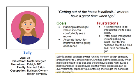
Problem Statement:
Sally is a busy business owner who needs a website that lets her select her movie seat in advance because it is hard for her to use traditional seats in theaters.
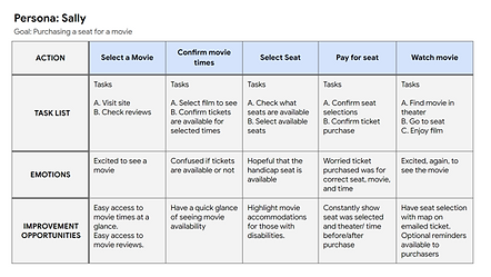
User Journey Map
I created a user journey map of Sally’s experience using the site to identify any additional pain points and improvement opportunities.
Starting the design
-
Sitemap
-
Paper wireframes
-
Digital wireframes
-
Low-fidelity prototypes
-
Usability studies
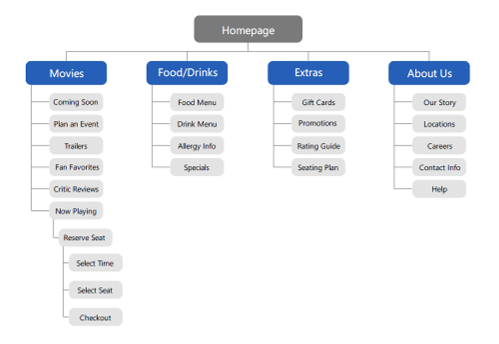
Sitemap
Difficulty with navigation was a primary pain point for users, so I used that knowledge to create a site map.
Clear categories and strategic hierarchies were the priorities during design.
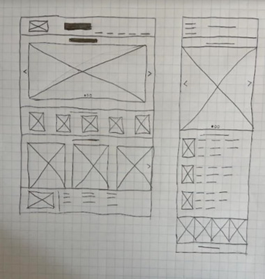
Paper wireframes
Next, I sketched out paper wireframes for each screen of my website, keeping pain points in mind.
The home screen paper wireframes variations to the right focus on optimizing the movie selecting process for users.
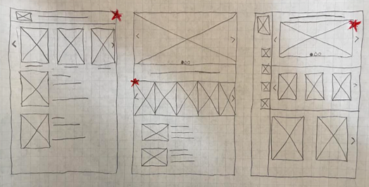
Stars were used to mark the elements of each sketch that would be used in the initial digital wireframes.
Paper wireframes
screen size variation(s)
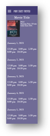
Because users can access Main Street Theater’s website on various devices, I designed additional screen sizes to ensure the site would be fully responsive.
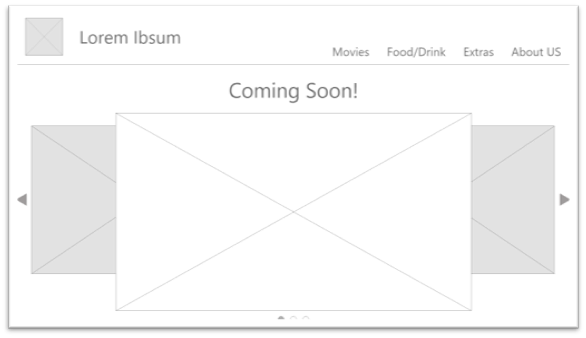
Digital Wireframes
Moving from paper to digital wireframes made it easy to understand how the redesign could help address user pain points.
Prioritizing useful button locations on the homepage was a priority during design.


Digital Wireframes
screen size variation(s)
Low-fidelity Prototype
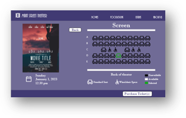
To create a low-fidelity prototype I connected all of the screens involved in the primary user flow of selecting a movie and purchasing a seat.
At this point, I received feedback on my designs on aspects like the placement of buttons and page organization. User pain points were also considered.

Usability Study: parameters
Usability Study: findings
1. Movies
Users wanted easy access to the movie times and availability
2. Checkout
Users wanted consistent feedback about what they are purchasing
3. Tickets
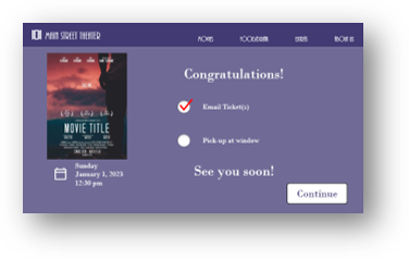
Users wanted options for picking up tickets in person in addition to emailed tickets
Refining the design
-
Mockups
-
High-fidelity prototype
-
Accessibility
Mockups
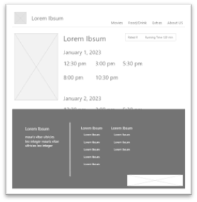
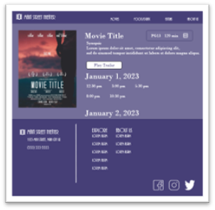
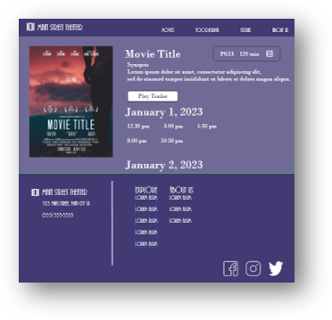
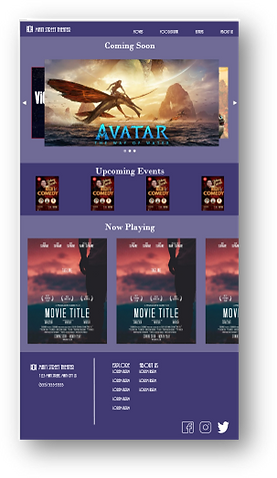
Based on the insights from the usability study, I made changes to improve the site’s accessibility. One of the changes I made was adding information about close captioning to movies and easier access to trailers on the movie time page.
Before usability study
After usability study
Mockups
screen size variations
Accessibility considerations
1
I used heading with different-sized texts for a clear visual hierarchy.
2
I designed a site with alt text available on each page for smooth screen reader access.
3
Added icons to make navigation easier.
Going forward
-
Takeaways
-
Next Steps
Takeaways
Impact:
The website makes it easier for users to purchase movie tickets and visit the movies with confidence.
What I learned:
I learned that many different steps are needed to be added to make it easier for users. Usability studies and peer feedback were critical in coming to that conclusion.
Next Steps
1
Conduct another usability study to validate whether the pain points users experienced have been addressed properly.
2
Conduct additional research to see what services might need to be added to improve the user experience.
3
Confer with peers to discuss additional layouts that might have a positive impact on the user experience.
